Archive for the ‘Data Analytics’ Category
Preface to “Data Science and Analytics Strategy: An Emergent Design Approach”
As we were close to completing the book (sample available here), Harvard Business Review published an article entitled, Is Data Scientist Still the Sexiest Job of the 21st Century? The article revisits a claim made a decade ago, in a similarly titled piece about the attractiveness of the profession.2 In the recent article, the authors note that although data science is now a well- established function in the business world, setting up the function presents a number of traps for the unwary. In particular, they identify the following challenges:
- The diverse skills required to do data science in an organisational setting.
- A rapidly evolving technology landscape.
- Issues around managing data science projects; in particular, productionising data science models – i.e., deploying them for ongoing use in business decision- making.
- Putting in place the organisational structures/ processes and cultivating individual dispositions to ensure that data science is done in an ethical manner.
On reviewing our nearly completed manuscript, we saw that we have spoken about each of these issues, in nearly the same order that they are discussed in the article (see the titles of Chapters 5– 8). It appears that the issues we identified as pivotal are indeed the ones that organisations face when setting up a new data science function. That said, the approach we advocate to tackle these challenges is somewhat unusual and therefore merits a prefatory explanation.
The approach proposed in this book arose from the professional experiences of two very different individuals, whose thoughts on how to “do data” in organisational settings converged via innumerable conversations over the last five years. Prior to working on this book, we collaborated on developing and teaching an introductory postgraduate data science course to diverse audiences ranging from data analysts and IT professionals to sociologists and journalists. At the same time, we led very different professional lives, working on assorted data- related roles in multinational enterprises, government, higher education, not- for- profit organisations and start- ups. The main lesson we learned from our teaching and professional experiences is that, when building data capabilities, it is necessary to first understand where people are – in terms of current knowledge, past experience, and future plans – and grow the capability from there.
To summarise our approach in a line: data capabilities should be grown, not grafted.
This is the central theme of Emergent Design, which we introduce in Chapter 1 and elaborate in Chapter 3. The rest of the book is about building a data science capability using this approach.
Naturally, we were keen to sense- check our thinking with others. To this end, we interviewed a number of well- established data leaders and practitioners from diverse domains, asking them about their approach to setting up and maintaining data science capabilities. You will find their quotes scattered liberally across the second half of this book. When speaking with these individuals, we found that most of them tend to favour an evolutionary approach not unlike the one we advocate in the book. To be sure, organisations need formal structures and processes in place to ensure consistency, but many of the data leaders we spoke with emphasised the need to grow these in a gradual manner, taking into account the specific context of their organisations.
It seems to us that many who are successful in building data science and analytics capabilities tacitly use an emergent design approach, or at least some elements of it. Yet, there is very little discussion about this approach in the professional and academic literature. This book is our attempt at bridging this gap.
Although primarily written for business managers and senior data professionals who are interested in establishing modern data capabilities in their organisations, we are also speaking to a wider audience ranging from data science and business students to data professionals who would like to step into management roles. Last but not least, we hope the book will appeal to curious business professionals who would like to develop a solid understanding of the various components of a modern data capability. That said, regardless of their backgrounds and interests, we hope readers will find this book useful … and dare we say, an enjoyable read.
Note:
You can buy the book from the Routledge website. If you do, please use the code AFL03 for a 20% discount (code valid until end 2023). Note that the discount has already been applied in some countries.

Tackling the John Smith Problem – deduplicating data via fuzzy matching in R
Last week I attended a CRM & data user group meeting for not-for-profits (NFPs), organized by my friend Yael Wasserman from Mission Australia. Following a presentation from a vendor, we broke up into groups and discussed common data quality issues that NFPs (and dare I say most other organisations) face. Number one on the list was the vexing issue of duplicate constituent (donor) records – henceforth referred to as dupes. I like to call this the John Smith Problem as it is likely that a typical customer database in a country with a large Anglo population is likely to have a fair number of records for customers with that name. The problem is tricky because one has to identify John Smiths who appear to be distinct in the database but are actually the same person, while also ensuring that one does not inadvertently merge two distinct John Smiths.

(Picture Credit: Clone Team by Dawn Hudson, https://www.dreamstime.com/royalty-free-stock-photos-clone-team-image8071248)
The John Smith problem is particularly acute for NFPs as much of their customer data comes in either via manual data entry or bulk loads with less than optimal validation. To be sure, all the NFPs represented at the meeting have some level of validation on both modes of entry, but all participants admitted that dupes tend to sneak in nonetheless…and at volumes that merit serious attention. Yael and his team have had some success in cracking the dupe problem using SQL-based matching of a combination of fields such as first name, last name and address or first name, last name and phone number and so on. However, as he pointed out, this method is limited because:
- It does not allow for typos and misspellings.
- Matching on too few fields runs the risk of false positives – i.e. labelling non-dupes as dupes.
The problems arise because SQL-based matching requires one to pre-specify match patterns. The solution is straightforward: use fuzzy matching instead. The idea behind fuzzy matching is simple: allow for inexact matches, assigning each match a similarity score ranging from 0 to 1 with 0 being complete dissimilarity and 1 being a perfect match. My primary objective in this article is to show how one can make headway with the John Smith problem using the fuzzy matching capabilities available in R.
A bit about fuzzy matching
Before getting down to fuzzy matching, it is worth a brief introduction on how it works. The basic idea is simple: one has to generalise the notion of a match from a binary “match” / “no match” to allow for partial matching. To do this, we need to introduce the notion of an edit distance, which is essentially the minimum number of operations required to transform one string into another. For example, the edit distance between the strings boy and bay is 1: there’s only one edit required to transform one string to the other. The Levenshtein distance is the most commonly used edit distance. It is essentially, “the minimum number of single-character edits (insertions, deletions or substitutions) required to change one word into the other.”
A variant called the Damerau-Levenshtein distance, which additionally allows for the transposition of two adjacent characters (counted as one operation, not two) is found to be more useful in practice. We’ll use an implementation of this called the optimal string alignment (osa) distance. If you’re interested in finding out more about osa, check out the Damerau-Levenshtein article linked to earlier in this paragraph.
Since longer strings will potentially have larger numeric distances between them, it makes sense to normalise the distance to a value lying between 0 and 1. We’ll do this by dividing the calculated osa distance by the length of the larger of the two strings . Yes, this is crude but, as you will see, it works reasonably well. The resulting number is a normalised measure of the dissimilarity between the two strings. To get a similarity measure we simply subtract the dissimilarity from 1. So, a normalised dissimilarity of 1 translates to similarity score of 0 – i.e. the strings are perfectly dissimilar. I hope I’m not belabouring the point; I just want to make sure it is perfectly clear before going on.
Preparation
In what follows, I assume you have R and RStudio installed. If not, you can access the software here and here for Windows and here for Macs; installation for both products is usually quite straightforward.
You may also want to download the Excel file many_john_smiths which contains records for ten fictitious John Smiths. At this point I should affirm that as far as the dataset is concerned, any resemblance to actual John Smiths, living or dead, is purely coincidental! Once you have downloaded the file you will want to open it in Excel and examine the records and save it as a csv file in your R working directory (or any other convenient place) for processing in R.
As an aside, if you have access to a database, you may also want to load the file into a table called many_john_smiths and run the following dupe-detecting SQL statement:
select * from many_john_smiths t1

where exists

(select 'x' from many_john_smiths t2

where

t1.FirstName=t2.FirstName

and

t1.LastName=t2.LastName

and

t1.AddressPostcode=t2.AddressPostcode

and

t1.CustomerID <> t2.CustomerID)
You may also want to try matching on other column combinations such as First/Last Name and AddressLine1 or First/Last Name and AddressSuburb for example. The limitations of column-based exact matching will be evident immediately. Indeed, I have deliberately designed the records to highlight some of the issues associated with dirty data: misspellings, typos, misheard names over the phone etc. A quick perusal of the records will show that there are probably two distinct John Smiths in the list. The problem is to quantify this observation. We do that next.
Tackling the John Smith problem using R
We’ll use the following libraries: stringdist and stringi . The first library, stringdist, contains a bunch of string distance functions, we’ll use stringdistmatrix() which returns a matrix of pairwise string distances (osa by default) when passed a vector of strings, and stringi has a number of string utilities from which we’ll use str_length(), which returns the length of string.
OK, so on to the code. The first step is to load the required libraries:
#load libraries

library("stringdist")

library("stringr")
We then read in the data, ensuring that we override the annoying default behaviour of R, which is to convert strings to categorical variables – we want strings to remain strings!
#read data, taking care to ensure that strings remain strings

df <- read.csv("many_john_smiths.csv",stringsAsFactors = F)

#examine dataframe

str(df)
The output from str(df) (not shown) indicates that all columns barring CustomerID are indeed strings (i.e. type=character).
The next step is to find the length of each row:
#find length of string formed by each row (excluding title)

rowlen <- str_length(paste0(df$FirstName,df$LastName,df$AddressLine1,

df$AddressPostcode,df$AddressSuburb,df$Phone))

#examine row lengths

rowlen

> [1] 41 43 39 42 28 41 42 42 42 43
Note that I have excluded the Title column as I did not think it was relevant to determining duplicates.
Next we find the distance between every pair of records in the dataset. We’ll use the stringdistmatrix()function mentioned earlier:
#stringdistmatrix - finds pairwise osa distance between every pair of elements in a

#character vector

d <- stringdistmatrix(paste0(df$FirstName,df$LastName,df$AddressLine1,

df$AddressPostcode,df$AddressSuburb,df$Phone))

d

1  2  3  4  5  6  7  8  9

2   7

3  10 13

4  15 21 24

5  19 26 26 15

6  22 21 28 12 18

7  20 23 26  9 21 14

8  10 13 17 20 23 25 22

9  19 22 19 21 24 29 23 22

10 17 22 25 13 22 19 16 22 24
stringdistmatrix() returns an object of type dist (distance), which is essentially a vector of pairwise distances.
For reasons that will become clear later, it is convenient to normalise the distance – i.e. scale it to a number that lies between 0 and 1. We’ll do this by dividing the distance between two strings by the length of the longer string. We’ll use the nifty base R function combn() to compute the maximum length for every pair of strings:
#find the length of the longer of two strings in each pair

pwmax <- combn(rowlen,2,max,simplify = T)
The first argument is the vector from which combinations are to be generated, the second is the group size (2, since we want pairs) and the third argument indicates whether or not the result should be returned as an array (simplify=T) or list (simplify=F). The returned object, pwmax, is a one-dimensional array containing the pairwise maximum lengths. This has the same length and is organised in the same way as the object d returned by stringdistmatrix() (check that!). Therefore, to normalise d we simply divide it by pwmax
#normalised distance

dist_norm <- d/pwmax
The normalised distance lies between 0 and 1 (check this!) so we can define similarity as 1 minus distance:
#similarity = 1 - distance

similarity <- round(1-dist_norm,2)

sim_matrix <- as.matrix(similarity)

sim_matrix

1    2    3    4    5    6    7    8    9   10

1  0.00 0.84 0.76 0.64 0.54 0.46 0.52 0.76 0.55 0.60

2  0.84 0.00 0.70 0.51 0.40 0.51 0.47 0.70 0.49 0.49

3  0.76 0.70 0.00 0.43 0.33 0.32 0.38 0.60 0.55 0.42

4  0.64 0.51 0.43 0.00 0.64 0.71 0.79 0.52 0.50 0.70

5  0.54 0.40 0.33 0.64 0.00 0.56 0.50 0.45 0.43 0.49

6  0.46 0.51 0.32 0.71 0.56 0.00 0.67 0.40 0.31 0.56

7  0.52 0.47 0.38 0.79 0.50 0.67 0.00 0.48 0.45 0.63

8  0.76 0.70 0.60 0.52 0.45 0.40 0.48 0.00 0.48 0.49

9  0.55 0.49 0.55 0.50 0.43 0.31 0.45 0.48 0.00 0.44

10 0.60 0.49 0.42 0.70 0.49 0.56 0.63 0.49 0.44 0.00
The diagonal entries are 0, but that doesn’t matter because we know that every string is perfectly similar to itself! Apart from that, the similarity matrix looks quite reasonable: you can, for example, see that records 1 and 2 (similarity score=0.84) are quite similar while records 1 and 6 are quite dissimilar (similarity score=0.46). Now let’s extract some results more systematically. We’ll do this by printing out the top 5 non-diagonal similarity scores and the associated records for each of them. This needs a bit of work. To start with, we note that the similarity matrix (like the distance matrix) is symmetric so we’ll convert it into an upper triangular matrix to avoid double counting. We’ll also set the diagonal entries to 0 to avoid comparing a record with itself:
#convert to upper triangular to prevent double counting

sim_matrix[lower.tri(sim_matrix)] <- 0

#set diagonals to zero to avoid comparing row to itself

diag(sim_matrix) <- 0
Next we create a function that returns the n largest similarity scores and their associated row and column number – we’ll need the latter to identify the pair of records that are associated with each score:
#adapted from:

#https://stackoverflow.com/questions/32544566/find-the-largest-values-on-a-matrix-in-r

nlargest <- function(m, n) {

res <- order(m, decreasing = T)[seq_len(n)];

pos <- arrayInd(res, dim(m), useNames = TRUE);

list(values = m[res],

position = pos)

}
The function takes two arguments: a matrix m and a number n indicating the top n scores to be returned. Let’s set this number to 5 – i.e. we want the top 5 scores and the associated record indexes. We’ll store the output of nlargest in the variable sim_list:
top_n <- 5

sim_list <- nlargest(sim_matrix,top_n)
Finally, we loop through sim_list printing out the scores and associated records as we go along:
for (i in 1:top_n){

rec <- as.character(df[sim_list$position[i],])

sim_rec <- as.character(df[sim_list$position[i+top_n],])

cat("score: ",sim_list$values[i],"\n")

cat("record 1: ",rec,"\n")

cat ("record 2: ",sim_rec,"\n\n")

}

score:  0.84

record 1:  1 John Smith Mr 12 Acadia Rd Burnton 9671 1234 5678

record 2:  2 Jhon Smith Mr 12 Arcadia Road Bernton 967 1233 5678
score: 0.79

record 1: 4 John Smith Mr 13 Kynaston Rd Burnton 9671 34561234

record 2: 7 Jon Smith Mr. 13 Kinaston Rd Barnston 9761 36451223
score: 0.76

record 1: 1 John Smith Mr 12 Acadia Rd Burnton 9671 1234 5678

record 2: 3 J Smith Mr. 12 Acadia Ave Burnton 867`1 1233 567
score: 0.76

record 1: 1 John Smith Mr 12 Acadia Rd Burnton 9671 1234 5678

record 2: 8 John Smith Dr 12 Aracadia St Brenton 9761 12345666
score: 0.71

record 1: 4 John Smith Mr 13 Kynaston Rd Burnton 9671 34561234

record 2: 6 John S Dr. 12 Kinaston Road Bernton 9677 34561223
As you can see, the method correctly identifies close matches: there appear to be 2 distinct records (1 and 4) – and possibly more, depending on where one sets the similarity threshold. I’ll leave you to explore this further on your own.
The John Smith problem in real life
As a proof of concept, I ran the following SQL on a real CRM database hosted on SQL Server:
select

FirstName+LastName,

count(*)

from

TableName

group by

FirstName+LastName

having

count(*)>100

order by

count(*) desc
I was gratified to note that John Smith did indeed come up tops – well over 200 records. I suspected there were a few duplicates lurking within, so I extracted the records and ran the above R code (with a few minor changes). I found there indeed were some duplicates! I also observed that the code ran with no noticeable degradation despite the dataset having well over 10 times the number of records used in the toy example above. I have not run it for larger datasets yet, but I suspect one will run into memory issues when the number of records gets into the thousands. Nevertheless, based on my experimentation thus far, this method appears viable for small datasets.
The problem of deduplicating large datasets is left as an exercise for motivated readers 😛
Wrapping up
Often organisations will turn to specialist consultancies to fix data quality issues only to find that their work, besides being quite pricey, comes with a lot of caveats and cosmetic fixes that do not address the problem fully. Given this, there is a case to be made for doing as much of the exploratory groundwork as one can so that one gets a good idea of what can be done and what cannot. At the very least, one will then be able to keep one’s consultants on their toes. In my experience, the John Smith problem ranks right up there in the list of data quality issues that NFPs and many other organisations face. This article is intended as a starting point to address this issue using an easily available and cost effective technology.
Finally, I should reiterate that the approach discussed here is just one of many possible and is neither optimal nor efficient. Nevertheless, it works quite well on small datasets, and is therefore offered here as a starting point for your own attempts at tackling the problem. If you come up with something better – as I am sure you can – I’d greatly appreciate your letting me know via the contact page on this blog or better yet, a comment.
Acknowledgements:
I’m indebted to Homan Zhao and Sree Acharath for helpful conversations on fuzzy matching. I’m also grateful to all those who attended the NFP CRM and Data User Group meetup that was held earlier this month – the discussions at that meeting inspired this piece.
An intuitive introduction to support vector machines using R – Part 1
About a year ago, I wrote a piece on support vector machines as a part of my gentle introduction to data science R series. So it is perhaps appropriate to begin this piece with a few words about my motivations for writing yet another article on the topic.
Late last year, a curriculum lead at DataCamp got in touch to ask whether I’d be interested in developing a course on SVMs for them.
My answer was, obviously, an enthusiastic “Yes!”
Instead of rehashing what I had done in my previous article, I thought it would be interesting to try an approach that focuses on building an intuition for how the algorithm works using examples of increasing complexity, supported by visualisation rather than math. This post is the first part of a two-part series based on this approach.
The article builds up some basic intuitions about support vector machines (abbreviated henceforth as SVM) and then focuses on linearly separable problems. Part 2 (to be released at a future date) will deal with radially separable and more complex data sets. The focus throughout is on developing an understanding what the algorithm does rather than the technical details of how it does it.
Prerequisites for this series are a basic knowledge of R and some familiarity with the ggplot package. However, even if you don’t have the latter, you should be able to follow much of what I cover so I encourage you to press on regardless.
<advertisement> if you have a DataCamp account, you may want to check out my course on support vector machines using R. Chapters 1 and 2 of the course closely follow the path I take in this article. </advertisement>
A one dimensional example
A soft drink manufacturer has two brands of their flagship product: Choke (sugar content of 11g/100ml) and Choke-R (sugar content 8g/100 ml). The actual sugar content can vary quite a bit in practice so it can sometimes be hard to figure out the brand given the sugar content. Given sugar content data for 25 samples taken randomly from both populations (see file sugar_content.xls), our task is to come up with a decision rule for determining the brand.
Since this is one-variable problem, the simplest way to discern if the samples fall into distinct groups is through visualisation. Here’s one way to do this using ggplot:
…and here’s the resulting plot:

Figure 1: Sugar content of samples
Note that we’ve simulated a one-dimensional plot by setting all the y values to 0.
From the plot, it is evident that the samples fall into distinct groups: low sugar content, bounded above by the 8.8 g/100ml sample and high sugar content, bounded below by the 10 g/100ml sample.
Clearly, any point that lies between the two points is an acceptable decision boundary. We could, for example, pick 9.1g/100ml and 9.7g/100ml. Here’s the R code with those points added in. Note that we’ve made the points a bit bigger and coloured them red to distinguish them from the sample points.
label=d_bounds$sep, size=2.5,
vjust=2, hjust=0.5, colour=”red”)
And here’s the plot:
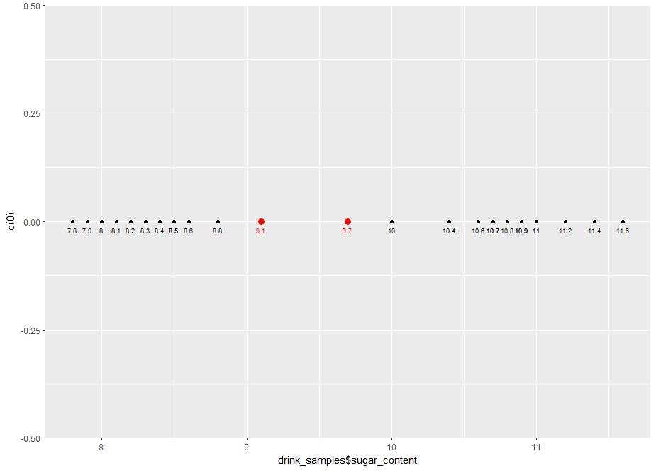
Figure 2: Plot showing example decision boundaries (in red)
Now, a bit about the decision rule. Say we pick the first point as the decision boundary, the decision rule would be:
Say we pick 9.1 as the decision boundary, our classifier (in R) would be:
The other one is left for you as an exercise.
Now, it is pretty clear that although either these points define an acceptable decision boundary, neither of them are the best. Let’s try to formalise our intuitive notion as to why this is so.
The margin is the distance between the points in both classes that are closest to the decision boundary. In case at hand, the margin is 1.2 g/100ml, which is the difference between the two extreme points at 8.8 g/100ml (Choke-R) and 10 g/100ml (Choke). It should be clear that the best separator is the one that lies halfway between the two extreme points. This is called the maximum margin separator. The maximum margin separator in the case at hand is simply the average of the two extreme points:
geom_point(data=mm_sep,aes(x=mm_sep$sep, y=c(0)), colour=”blue”, size=4)
And here’s the plot:

Figure 3: Plot showing maximum margin separator (in blue)
We are dealing with a one dimensional problem here so the decision boundary is a point. In a moment we will generalise this to a two dimensional case in which the boundary is a straight line.
Let’s close this section with some general points.
Remember this is a sample not the entire population, so it is quite possible (indeed likely) that there will be as yet unseen samples of Choke-R and Choke that have a sugar content greater than 8.8 and less than 10 respectively. So, the best classifier is one that lies at the greatest possible distance from both classes. The maximum margin separator is that classifier.
This toy example serves to illustrate the main aim of SVMs, which is to find an optimal separation boundary in the sense described here. However, doing this for real life problems is not so simple because life is not one dimensional. In the remainder of this article and its yet-to-be-written sequel, we will work through examples of increasing complexity so as to develop a good understanding of how SVMs work in addition to practical experience with using the popular SVM implementation in R.
<Advertisement> Again, for those of you who have DataCamp premium accounts, here is a course that covers pretty much the entire territory of this two part series. </Advertisement>
Linearly separable case
The next level of complexity is a two dimensional case (2 predictors) in which the classes are separated by a straight line. We’ll create such a dataset next.
Let’s begin by generating 200 points with attributes x1 and x2, randomly distributed between 0 and 1. Here’s the R code:
Let’s visualise the generated data using a scatter plot:
And here’s the plot

Figure 4: scatter plot of uniformly distributed datapoints
Now let’s classify the points that lie above the line x1=x2 as belonging to the class +1 and those that lie below it as belonging to class -1 (the class values are arbitrary choices, I could have chosen them to be anything at all). Here’s the R code:
Let’s modify the plot in Figure 4, colouring the points classified as +1n blue and those classified -1 red. For good measure, let’s also add in the decision boundary. Here’s the R code:
Note that the parameters in geom_abline() are derived from the fact that the line x1=x2 has slope 1 and y intercept 0.
Here’s the resulting plot:

Figure 5: Linearly separable dataset with boundary.
Next let’s introduce a margin in the dataset. To do this, we need to exclude points that lie within a specified distance of the boundary. A simple way to approximate this is to exclude points that have x1 and x2 values that differ by less a pre-specified value, delta. Here’s the code to do this with delta set to 0.05 units.
The check on the number of datapoints tells us that a number of points have been excluded.
Running the previous ggplot code block yields the following plot which clearly shows the reduced dataset with the depopulated region near the decision boundary:

Figure 6: Dataset with margin (note depleted areas on either side of boundary)
Let’s add the margin boundaries to the plot. We know that these are parallel to the decision boundary and lie delta units on either side of it. In other words, the margin boundaries have slope=1 and y intercepts delta and –delta. Here’s the ggplot code:
And here’s the plot with the margins:

Figure 7: Linearly separable dataset with margin and decision boundary displayed
OK, so we have constructed a dataset that is linearly separable, which is just a short code for saying that the classes can be separated by a straight line. Further, the dataset has a margin, i.e. there is a “gap” so to speak, between the classes. Let’s save the dataset so that we can use it in the next section where we’ll take a first look at the svm() function in the e1071 package.
That done, we can now move on to…
Linear SVMs
Let’s begin by reading in the datafile we created in the previous section:
We then split the data into training and test sets using an 80/20 random split. There are many ways to do this. Here’s one:
The next step is to build the an SVM classifier model. We will do this using the svm() function which is available in the e1071 package. The svm() function has a range of parameters. I explain some of the key ones below, in particular, the following parameters: type, cost, kernel and scale. It is recommended to have a browse of the documentation for more details.
The type parameter specifies the algorithm to be invoked by the function. The algorithm is capable of doing both classification and regression. We’ll focus on classification in this article. Note that there are two types of classification algorithms, nu and C classification. They essentially differ in the way that they penalise margin and boundary violations, but can be shown to lead to equivalent results. We will stick with C classification as it is more commonly used. The “C” refers to the cost which we discuss next.
The cost parameter specifies the penalty to be applied for boundary violations. This parameter can vary from 0 to infinity (in practice a large number compared to 0, say 10^6 or 10^8). We will explore the effect of varying cost later in this piece. To begin with, however, we will leave it at its default value of 1.
The kernel parameter specifies the kind of function to be used to construct the decision boundary. The options are linear, polynomial and radial. In this article we’ll focus on linear kernels as we know the decision boundary is a straight line.
The scale parameter is a Boolean that tells the algorithm whether or not the datapoints should be scaled to have zero mean and unit variance (i.e. shifted by the mean and scaled by the standard deviation). Scaling is generally good practice to avoid undue influence of attributes that have unduly large numeric values. However, in this case we will avoid scaling as we know the attributes are bounded and (more important) we would like to plot the boundary obtained from the algorithm manually.
Building the model is a simple one-line call, setting appropriate values for the parameters:
We expect a linear model to perform well here since the dataset it is linear by construction. Let’s confirm this by calculating training and test accuracy. Here’s the code:
The perfect accuracies confirm our expectation. However, accuracies by themselves are misleading because the story is somewhat more nuanced. To understand why, let’s plot the predicted decision boundary and margins using ggplot. To do this, we have to first extract information regarding these from the svm model object. One can obtain summary information for the model by typing in the model name like so:
kernel = “linear”, scale = FALSE)
Which outputs the following: the function call, SVM type, kernel and cost (which is set to its default). In case you are wondering about gamma, although it’s set to 0.5 here, it plays no role in linear SVMs. We’ll say more about it in the sequel to this article in which we’ll cover more complex kernels. More interesting are the support vectors. In a nutshell, these are training dataset points that specify the location of the decision boundary. We can develop a better understanding of their role by visualising them. To do this, we need to know their coordinates and indices (position within the dataset). This information is stored in the SVM model object. Specifically, the index element of svm_model contains the indices of the training dataset points that are support vectors and the SV element lists the coordinates of these points. The following R code lists these explicitly (Note that I’ve not shown the outputs in the code snippet below):
Let’s use the indices to visualise these points in the training dataset. Here’s the ggplot code to do that:
And here is the plot:

Figure 8: Training dataset showing support vectors
We now see that the support vectors are clustered around the boundary and, in a sense, serve to define it. We will see this more clearly by plotting the predicted decision boundary. To do this, we need its slope and intercept. These aren’t available directly available in the svm_model, but they can be extracted from the coefs, SV and rho elements of the object.
The first step is to use coefs and the support vectors to build the what’s called the weight vector. The weight vector is given by the product of the coefs matrix with the matrix containing the SVs. Note that the fact that only the support vectors play a role in defining the boundary is consistent with our expectation that the boundary should be fully specified by them. Indeed, this is often touted as a feature of SVMs in that it is one of the few classifiers that depends on only a small subset of the training data, i.e. the datapoints closest to the boundary rather than the entire dataset.
Once we have the weight vector, we can calculate the slope and intercept of the predicted decision boundary as follows:
Note that the slope and intercept are quite different from the correct values of 1 and 0 (reminder: the actual decision boundary is the line x1=x2 by construction). We’ll see how to improve on this shortly, but before we do that, let’s plot the decision boundary using the slope and intercept we have just calculated. Here’s the code:
And here’s the augmented plot:

Figure 9: Training dataset showing support vectors and decision boundary
The plot clearly shows how the support vectors “support” the boundary – indeed, if one draws line segments from each of the points to the boundary in such a way that the intersect the boundary at right angles, the lines can be thought of as “holding the boundary in place”. Hence the term support vector.
This is a good time to mention that the e1071 library provides a built-in plot method for svm function. This is invoked as follows:
The svm plot function takes a formula specifying the plane on which the boundary is to be plotted. This is not necessary here as we have only two predictors (x1 and x2) which automatically define a plane.
Here is the plot generated by the above code:

Figure 10: Decision boundary for linearly separable dataset visualised using svm.plot()
Note that the axes are switched (x1 is on the y axis). Aside from that, the plot is reassuringly similar to our ggplot version in Figure 9. Also note that that the support vectors are marked by “x”. Unfortunately the built in function does not display the margin boundaries, but this is something we can easily add to our home-brewed plot. Here’s how. We know that the margin boundaries are parallel to the decision boundary, so all we need to find out is their intercept. It turns out that the intercepts are offset by an amount 1/w[2] units on either side of the decision boundary. With that information in hand we can now write the the code to add in the margins to the plot shown in Figure 9. Here it is:
geom_abline(slope=slope_1,intercept = intercept_1+1/w[2], linetype=”dashed”)
And here is the plot with the margins added in:

Figure 11: Training dataset showing support vectors + decision and margin boundaries
Note that the predicted margins are much wider than the actual ones (compare with Figure 7). As a consequence, many of the support vectors lie within the predicted margin – that is, they violate it. The upshot of the wide margin is that the decision boundary is not tightly specified. This is why we get a significant difference between the slope and intercept of predicted decision boundary and the actual one. We can sharpen the boundary by narrowing the margin. How do we do this? We make margin violations more expensive by increasing the cost. Let’s see this margin-narrowing effect in action by building a model with cost = 100 on the same training dataset as before. Here is the code:
I’ll leave you to calculate the training and test accuracies (as one might expect, these will be perfect).
Let’s inspect the cost=100 model:
kernel = “linear”,cost=100, scale = FALSE)
The number of support vectors is reduced from 55 to 6! We can plot these and the boundary / margin lines using ggplot as before. The code is identical to the previous case (see code block preceding Figure 8). If you run it, you will get the plot shown in Figure 12.

Figure 12: Training dataset showing support vectors for cost=100 case
Since the boundary is more tightly specified, we would expect the slope and intercept of the predicted boundary to be considerably closer to their actual values of 1 and 0 respectively (as compared to the default cost case). Let’s confirm that this is so by calculating the slope and intercept as we did in the code snippets preceding Figure 9. Here’s the code:
Which nicely confirms our expectation.
The decision boundary and margins for the high cost case can also be plotted with the code shown earlier. Her it is for completeness:
geom_abline(slope=slope_100,intercept = intercept_100+1/w[2], linetype=”dashed”)
And here’s the plot:

Figure 13: Training dataset with support vectors predicted decision boundary and margins for cost=100
SVMs that allow margin violations are called soft margin classifiers and those that do not are called hard. In this case, the hard margin classifier does a better job because it specifies the boundary more accurately than its soft counterpart. However, this does not mean that hard margin classifier are to be preferred over soft ones in all situations. Indeed, in real life, where we usually do not know the shape of the decision boundary upfront, soft margin classifiers can allow for a greater degree of uncertainty in the decision boundary thus improving generalizability of the classifier.
OK, so now we have a good feel for what the SVM algorithm does in the linearly separable case. We will round out this article by looking at a real world dataset that fortuitously turns out to be almost linearly separable: the famous (notorious?) iris dataset. It is instructive to look at this dataset because it serves to illustrate another feature of the e1071 SVM algorithm – its capability to handle classification problems that have more than 2 classes.
A multiclass problem
The iris dataset is well-known in the machine learning community as it features in many introductory courses and tutorials. It consists of 150 observations of 3 species of the iris flower – setosa, versicolor and virginica. Each observation consists of numerical values for 4 independent variables (predictors): petal length, petal width, sepal length and sepal width. The dataset is available in a standard installation of R as a built in dataset. Let’s read it in and examine its structure:
Now, as it turns out, petal length and petal width are the key determinants of species. So let’s create a scatterplot of the datapoints as a function of these two variables (i.e. project each data point on the petal length-petal width plane). We will also distinguish between species using different colour. Here’s the ggplot code to do this:
And here’s the plot:

Figure 15: iris dataset, petal width vs petal length
On this plane we see a clear linear boundary between setosa and the other two species, versicolor and virginica. The boundary between the latter two is almost linear. Since there are four predictors, one would have to plot the other combinations to get a better feel for the data. I’ll leave this as an exercise for you and move on with the assumption that the data is nearly linearly separable. If the assumption is grossly incorrect, a linear SVM will not work well.
Up until now, we have discussed binary classification problem, i.e. those in which the predicted variable can take on only two values. In this case, however, the predicted variable, Species, can take on 3 values (setosa, versicolor and virginica). This brings up the question as to how the algorithm deals multiclass classification problems – i.e those involving datasets with more than two classes. The SVM algorithm does this using a one-against-one classification strategy. Here’s how it works:
- Divide the dataset (assumed to have N classes) into N(N-1)/2 datasets that have two classes each.
- Solve the binary classification problem for each of these subsets
- Use a simple voting mechanism to assign a class to each data point.
Basically, each data point is assigned the most frequent classification it receives from all the binary classification problems it figures in.
With that said, let’s get on with building the classifier. As before, we begin by splitting the data into training and test sets using an 80/20 random split. Here is the code to do this:
Then we build the model (default cost) and examine it:
The main thing to note is that the function call is identical to the binary classification case. We get some basic information about the model by typing in the model name as before:
kernel = “linear”)
And the train and test accuracies are computed in the usual way:
This looks good, but is potentially misleading because it is for a particular train/test split. Remember, in this case, unlike the earlier example, we do not know the shape of the actual decision boundary. So, to get a robust measure of accuracy, we should calculate the average test accuracy over a number of train/test partitions. Here’s some code to do that:
Which is not too bad at all, indicating that the dataset is indeed nearly linearly separable. If you try different values of cost you will see that it does not make much difference to the average accuracy.
This is a good note to close this piece on. Those who have access to DataCamp premium courses will find that the content above is covered in chapters 1 and 2 of the course on support vector machines in R. The next article in this two-part series will cover chapters 3 and 4.
Summarising
My main objective in this article was to help develop an intuition for how SVMs work in simple cases. We illustrated the basic principles and terminology with a simple 1 dimensional example and then worked our way to linearly separable binary classification problems with multiple predictors. We saw how the latter can be solved using a popular svm implementation available in R. We also saw that the algorithm can handle multiclass problems. All through, we used visualisations to see what the algorithm does and how the key parameters affect the decision boundary and margins.
In the next part (yet to be written) we will see how SVMs can be generalised to deal with complex, nonlinear decision boundaries. In essence, the use a mathematical trick to “linearise” these boundaries. We’ll delve into details of this trick in an intuitive, visual way as we have done here.
Many thanks for reading!


